FMP Delfts Blauw / ceramics
- HildeMaassen
- Aug 18, 2020
- 6 min read
Delft blue vases have been made for centuries and can be found in all kinds of shapes as you can see below. What I'm curious about: what have artists and designers done with it?
I found that much that I stopped looking at decriptions halfway this list.


Front
The Blow Away Vase is a design by the Swedish design studio Front. made the design for the vase "Blow Away". The design is based on a traditional porcelain Delft blue vase and added some parameters to the material in the 3D software. It was then exposed to a simulated gust of wind.

Front made another vase: Changing. (see next figure)
"Chocolate" was the theme for the exhibition curated by Naoto Fukasawa at 21_21 Design Sight by Issey Miyake foundation. The front is inspired by figuratively shaped chocolate wrapped in metal foil. The 5 different layers of printed foil around the chocolate vase makes it a decorative object and a toy. It refers to the feeling you had as a child: wanting to tear the packaging up and keep it.


Nothing to do with Delfs blauw but with clouds: the made a carpet with a collage of clouds depicted in a variety of media from different eras.
What colour does a cloud have? We have studied representations of clouds in paintings and found hundreds of different tones and shades. Clouds have inspired artists, scientists and writers for centuries and on the carpet you see the brushtstrokes and marks of their attempts to capture these ephemeral sculptures.

Robert Bronwasser
A project in which traditional craftsmanship and contemporary design are brought together. Decorative and frivolous. and in a pottery series for Royal Goedewaagen. Frivolous, decorative and endearing.


Henk Schiffmacher


Henk Schiffmacher makes tattoo art. This work is a collaboration between 2 traditional crafts both from the east. Rich in culture, tradition and symbolism. Art forms that are applied manually once. With a needle in the skin or with a brush on the biscuit.
Arjen Brekveld

The Blue Collar Bottles are based on 17th and 18th century cabinet pieces, lushly decorated cups and vases that were placed on cabinets and mantelpieces, as a testimony to the wealth as well as the good taste of their owners. They were produced by a number of earthenware factories in Delft and are still much in demand as collectibles. Although Arian Brekveld designs objects that are meant to be used, the Blue Collar Bottles, like the traditional cabinet pieces, are primarily designed as decoration. This series is part of the Blue D1653 label.
The name of the label, Blue D1653, refers to "Delft Blue" and the year 1653 in which De Porceleyne Fles (now Royal Delft) was founded. But I also read that the "D" in the name can stand for "Design", "Dutch" and / or "Desire".
Chris Koens
This series "Proud Mary" is also made under label Blue D1653.
Named after Mary Stuart II. Wife of Lord Lieutenant Willem III. Great admirer and collector of Delft Blue in the golden age. The figurine is composed of four different elements; skirt, body, collar and head available in the hand painted and the transfer collection.


Damian O’Sullivan
The desire to inject a new lease of life into the age-old Delftware manufactory through design, lay at the heart of this project. Delftware at the crossroads between contemporary tableware and cultural relevqnce/significance, straddling beauty, form and avoiding the cliché. Delftware brought back into the 21st century, no mean feat. Made under label Blue D1653.


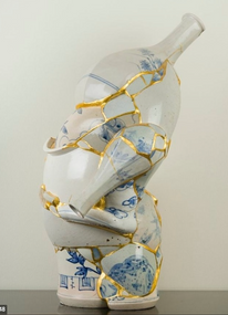
Livia Marin

Made from fragments of everyday objects – cups, bowls, jars, pots and the like – that appear as staged somehow indeterminately between something that is about to collapse or has just been restored; the series Nomad Pattern. Between things that have been invested with the attention of care but that also have the appearance of a ruin. These works aim to reflect on aspects of loss and care, disposal and preservation, and on the relationship we develop with the day-to-day objects that populate our everyday lives.

In the work Nature Morte she brings together the subject matter and composition characteristic of still life painting and the antique Japanese technique kintsugi (golden repair) for restoring ceramic objects.


Geng uses porcelain for many of her works, attracted by its symbolic and material properties. She uses its historical significance as a link between Eastern and Western traditions. In the 2014 stop-motion film Mr Sea, she uses Taoist teachings of the Chinese philosopher Zhuangzi. She animated porcelain figures in a story inspired by Pu Songling's short stories written during the Qing Dynasty.
The work Manga Ormolu shows an alienating dialogue of contemporary culture and associated technology and globalization through a fabricated relationship between ceramic tradition (using the shape of Chinese Ming dynasty vessels)
The West and East are united in the objects.


Left: drinking tea an ongoing project since 2001 and right vase 2009


Denise Romecki
1. Waves: Reflection
2. Waves: Wind surf 22h, 7w, 7d
3. Waves: Aqua ballet 20h, 8w, 8d


Studio Oddness

Adrianus Kundert and Thomas van der Sman of Studio ODDNESS in Eindhoven are fascinated with amorphstructures and randomness. To them, these two elements are antithesis of what is commonly seen in design world that usually doesn’t accept a random process for creation. Bubblegraphy is a series of vases with a mesmerising look. The pattern on each product is created by a special process of blowing air bubbles in the glaze. The coating creates a three dimensional motive and makes each vase unique.
Francesco Ardini
What I image being clouds.
The world is not based on linearity, but that its essence sinks into chaos. Uneven surfaces, the apparent decomposition, the linearity threatened by cracks, dynamics, are the direct features that create volumes that seem seemingly fragile and uncontrolled from my ceramics.


Fenella Elms
“All the work builds by connecting individual parts, developing an interaction through placing in formation. The shifting components form a fluid, co-operative body.”
Flow pots:


Li Xiaofeng
This has nothing to do with my project but since I think it is amazingly stunning ...


Lim + Lu


The Split vase is an exploration and an examination of the history and the process of
making ceramic vases. For each Split vase, we cast two iconic Ming vases together to
create a fusion of forms, and glazed over with 3 beautiful soft-hued glazes unique to Lim
+ Lu. The Split Vase give a new perspective to the iconic forms of Chinese vases. Each
vase is hand made and hand glazed. It takes its own identity during the firing process, no
two vases are alike.
Tony Marsch


Koike Shôko


Zemer Peled


Noriko Kuresumi
The sea is the origin of life. All lives are connected and have been supporting each other.
I create my work by imagining the source of harmony and balance of the ocean.


Emre Can

The Breakfast in the Middle East
3D Printed Porcelain and shatter by hand 1230°C 21 x 58 x 41 cm 2018
Yee Sookyung


Conversations In Ceramics: A Homegrown Exhibition https://theartling.com/en/artzine/conversations-in-ceramics-a-homegrown-exhibition/ Ma On Yee, Under The Wrinkles no.1, 2017, paper porcelain, glaze, stain, Image courtesy of Karin Weber Gallery.
References
ARDINI, Francesco. Website. Available at:https://www.francescoardini.com [accessed on 17 August 2020]
BREKVELD, Arjen. 2012. Blue Collar Bottles. Available at: https://www.arianbrekveld.com/products/#!blue-collar-bottles. [accessed on 17 August 2020]
BRONWASSER, Robert. Website. Available at: https://www.robertbronwasser.com/project/gdw-dsgn-collection/ [accessed on 17 August 2020]
CAN, Emre. Website. Available at: https://www.emrecanceramic.com/ [accessed on 17 August 2020]
ELMS, Fenella. Website. Available at:https://www.fenellaelms.com [accessed on 17 August 2020]
FRONT DESIGN. Website. Available at: http://www.frontdesign.se [accessed on 17 August 2020]
GOEDEWAGEN. Website. Available at: https://www.goedewaagen.nl/over-ons/urnencentrum-nederland/ [accessed on 17 August 2020]
JOBSON, Christopher. 2013. Melting Ceramics by Livia Marin. Available at: https://www.thisiscolossal.com/2013/07/melting-ceramics-by-livia-marin/ [accessed on 17 August 2020]
KURESUMI, Noriko. Website. Available at:. https://www.norikokuresumi.com [accessed on 17 August 2020]
LIM + LU. Website. Available at:https://theartling.com/en/designers/lim-lu/ [accessed on 17 August 2020]
MARIN, Livia. Website. Available at: https://www.liviamarin.com/ [accessed on 17 August 2020]
MARSCH, Tony. Website. Available at:https://www.tonymarshceramics.com [accessed on 17 August 2020]
MISTER DESIGN. Website. Available at: https://www.misterdesign.nl/blow-away-vase-moooi.html? [accessed on 17 August 2020]
O’SULLIVAN, Damian. 2011. Royal Delft. Available at: http://www.studioosullivan.com/#/royaldelft/ [accessed on 17 August 2020]
PELED, Zemer . Website. Available at: https://www.zemerpeled.com [accessed on 17 August 2020]
ROMECKI, Denise Website. Available at:https://www.deniseromecki.com [accessed on 17 August 2020]
ROYAL DELFT. Website. Available at: https://www.royaldelft.com/delfts-blauw-collecties/blued1653/item905 [accessed on 17 August 2020]
SATISH TANG, Brendan, Lee. Website. Available at: http://www.brendantang.com/#/new-gallery-5/ [accessed on 17 August 2020]
SCHIFFMACHER. 2020. Royal Delft en Schiffmacher Tattoo Heritage presenteren: Schiffmacher Royal Blue Tattoo Available at: https://www.royaldelft.com/ontdek-de-experience/royalbluetattoo/item8090 [accessed on 17 August 2020]
SHÔKO, Koike . Website. Available at:https://www.dutko.com/en/artists/52-shoko-koike/ [accessed on 17 August 2020]
SOOKYUNG, Yee. Website. Available at: https://www.yeesookyung.com [accessed on 17 August 2020]
STUDIO ODDNESS. Website. Available at: https://www.oode.nl/bubblegraphy-studio-oddness/ [accessed on 17 August 2020]
WON SOHN, Hae. Website. Available at: https://haewonsohn.com [accessed on 17 August 2020]
XIAOFENG, Li Website. Available at: https://www.chinesenewart.com/chinese-artists11/lixiaofeng.htm [accessed on 17 August 2020]
XUE, Geng. 2015. Available at: http://www.galleryek.com/artists/geng-xue/featured-works?view=slider#12 [accessed on 17 August 2020]
XUE, LEI. Website. Available at: https://www.artsy.net/artist/lei-xue [accessed on 17 August 2020]
Conversations In Ceramics: A Homegrown Exhibition https://theartling.com/en/artzine/conversations-in-ceramics-a-homegrown-exhibition/ Ma On Yee, Under The Wrinkles no.1, 2017, paper porcelain, glaze, stain, Image courtesy of Karin Weber Gallery. [accessed on 17 August 2020]


Comments